
Rental market reports
Multi measure analyses of pricing, supply, composition, space, affordability and market speed across the Netherlands and its cities.
Browse reportsRent growth heatmaps show where rental prices are accelerating, easing, or turning flat across local areas. Move from the displayed result on Rent Growth Heatmap in Goes to recency, property category, and sample before interpreting the pattern. In Goes, the value lies in spotting whether pricing pressure is spread evenly or concentrated in a few submarkets. That helps renters and analysts judge whether recent movement looks broad-based, selective, or temporary.
Compare the relative pace of rent growth across areas in Goes to see where momentum is strongest and where it is cooling. The most useful reading comes from differences between nearby submarkets, not from any single point in time. Small shifts can matter, but isolated spikes should be treated cautiously.
Figures come from the rental listings Luntero represents for the selected period. Sample sizes differ per location and month, so read short movements together with the underlying listing counts rather than as exact market wide changes.
Rent growth heatmaps show where rental prices are accelerating, easing, or turning flat across local areas. In Goes, the value lies in spotting whether pricing pressure is spread evenly or concentrated in a few submarkets. That helps renters and analysts judge whether recent movement looks broad-based, selective, or temporary.
Treat Rent Growth Heatmap — Goes as a framework for comparing related local measures, not a final judgment about the market or a home. For a useful reading of Rent Growth Heatmap in Goes, match housing mix and geography before judging denominator.
A heatmap helps separate broad rent growth from movement driven by only a few local areas in Goes.
Stronger shading usually signals where pricing pressure is building faster than in nearby submarkets.
Flatter areas can indicate a market that is stabilizing even when the wider city trend still looks firm.
Comparing adjacent areas is often more useful than focusing on one headline average alone.
Composition effects can make growth look stronger or weaker depending on the mix of homes being rented.
Show how local rent growth can diverge inside Goes even when the city average looks steady.
Use the heatmap to distinguish broad-based pricing pressure from isolated hotspots.
Compare accelerating, flattening, and reversing areas to understand market momentum.
Explain why nearby submarkets may move differently because of housing mix and demand shifts.
Frame the topic as a decision aid for renters and analysts watching early signs of tightening.
This page documents one indicator. The Goes overview brings the median advertised rent, cost per square metre, three trend windows, listing supply and the bedroom, property-type and furnishing mix together in a single reading.
Stay in Goes and switch the question. The same represented listing sample powers every metric and report below, so you can move from asking rent to price per square meter, supply, space and neighbourhood detail without losing the local context.
Compare Rent Growth Heatmap by Location across supported Dutch locations using the represented listing sample. Differences reflect the covered sources, period and methodology and are not complete measurements of local supply or demand.
Interpret Rent Growth Heatmap in Goes with observation count, period, and geography attached to the reported value. Open the broader rent growth heatmap report from the Goes result, distinguish supported evidence from interpretation, and preserve every methodological limit in the comparison.
Multi measure analyses of pricing, supply, composition, space, affordability and market speed across the Netherlands and its cities.
Browse reportsMedian and average asking rent, price per square meter, time on market, supply volume and the rest of the indicator library.
Browse metricsSee the apartments, rooms and houses currently advertised in Goes and filter them by price, size and property type.
Search Goes rentalsHave an idea for a new housing market chart, dataset, or analysis? Submit your request and help shape the next generation of Luntero’s rental market insights. Whether it’s a new metric, city comparison, or visualization, your input helps us expand coverage of Dutch housing trends and create data tools that serve renters, investors, and researchers across the Netherlands.
Explore the latest properties added to Luntero. Find new apartments, houses, and studios across the Netherlands — updated daily to help you discover your next home faster.
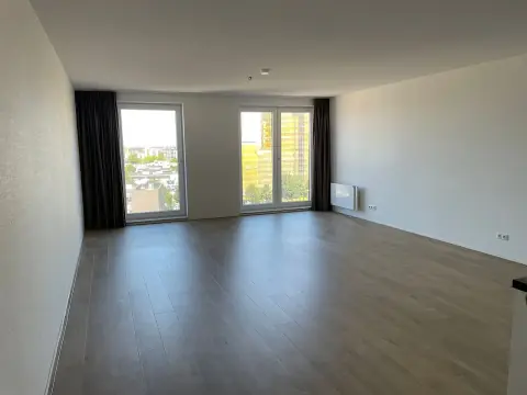
€1,159.00 / month

€600.00 / month
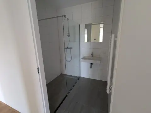
€932.00 / month
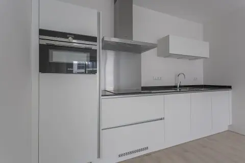
€1,187.00 / month
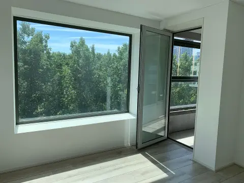
€1,845.00 / month
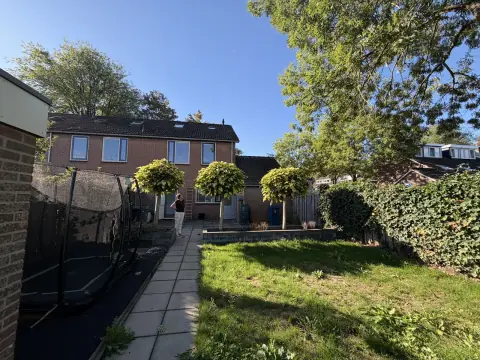
€933.00 / month

€1,899.00 / month
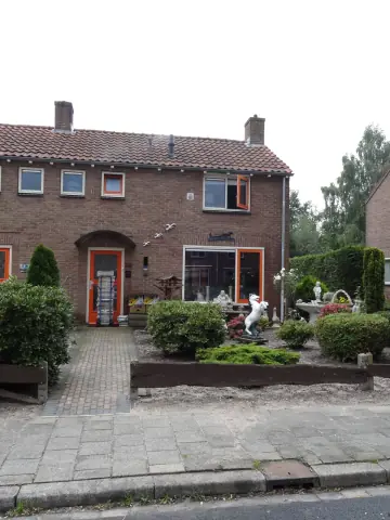
€765.00 / month
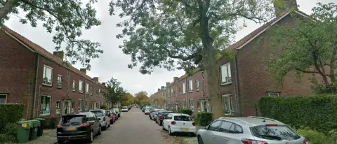
€714.00 / month

€1,596.00 / month
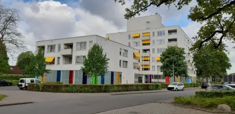
€714.00 / month

€1,210.00 / month
| Neighborhood | YoY growth | 3M annualized | Median rent | Listings |
|---|---|---|---|---|
| Goes-Zuid | 30.2% | -54.2% | €824 | 2 |
| Goes West | 28.3% | 308.1% | €973 | 2 |
| Goese Polder | 9.5% | -75.3% | €866 | 5 |
| Goes-Oost | -17.4% | -61.8% | – | 0 |
| Goes Centrum | -42.1% | -90.4% | €489 | 3 |